The Journal
A glimpse into Lee's personal projects, passions, and perspectives.
Discover and shop pieces inspired by the latest influences in interior design.
A curated edit of highlights and intriguing finds from social media.
A glimpse into Lee's personal projects, passions, and perspectives.
Discover and shop pieces inspired by the latest influences in interior design.
A curated edit of highlights and intriguing finds from social media.
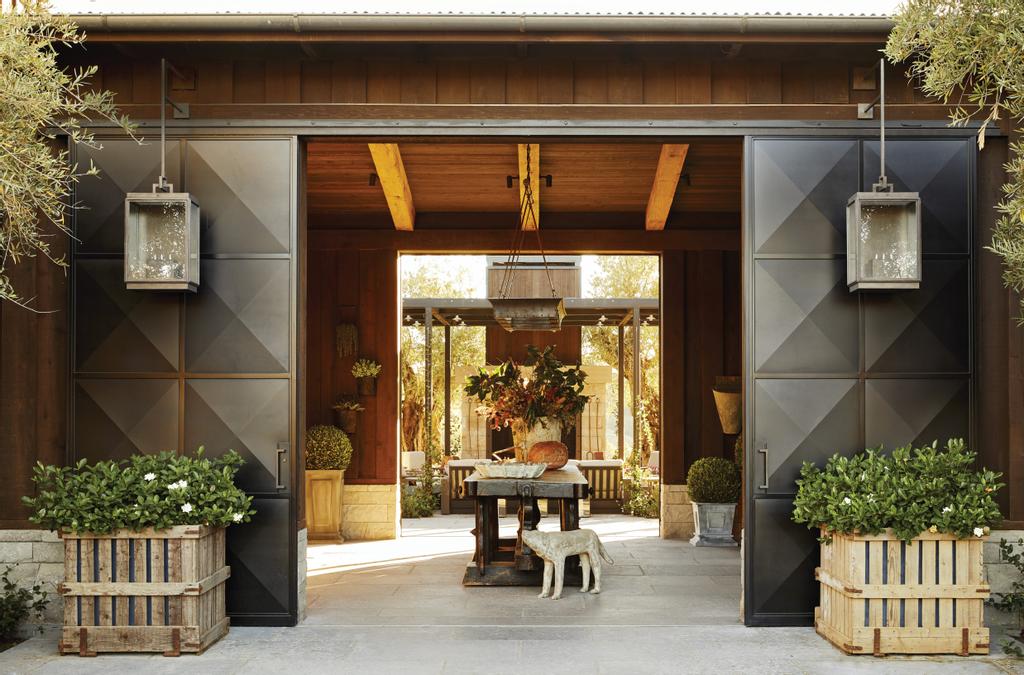
An inspiring Sonoma wine country project for a dear client and friend of mine.
Read more
Style Spotlight: The Musée Bourdelle
One of my very favorite places in the world, Paris's Musée Bourdelle.
Read more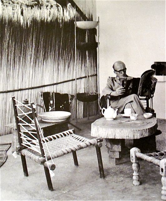
Home Is Where the Heart Is: Jeanneret in Chandigarh
On the fascinating work design legend Pierre Jeannaret produced for the city of Chandigarh, India.
Read more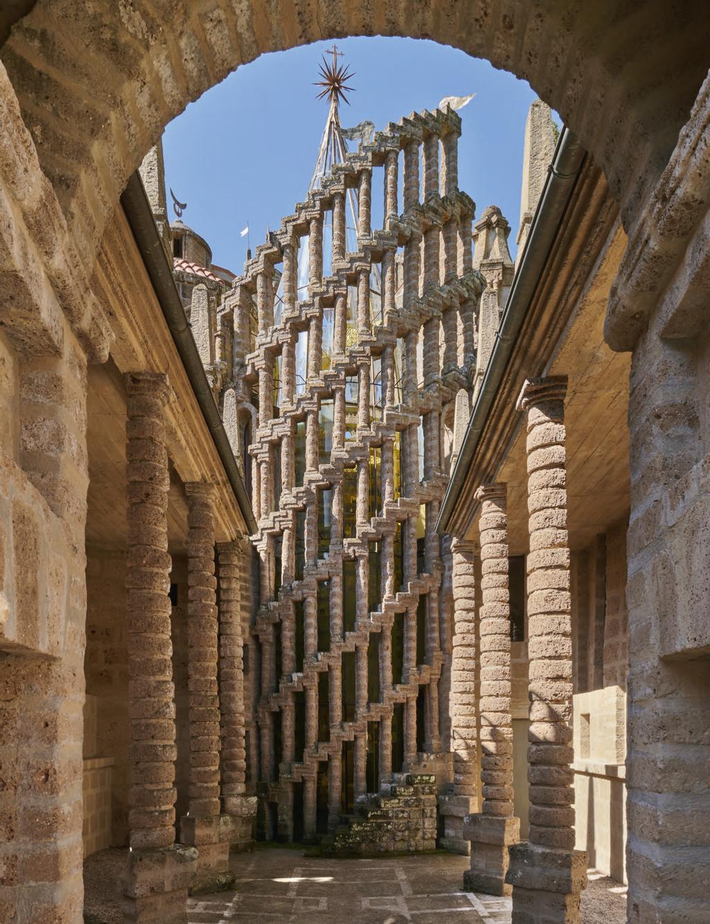
Nestled in the sloping hills of Umbria, a midcentury architect's dramatic vision for an ideal metaphysical city.
Read more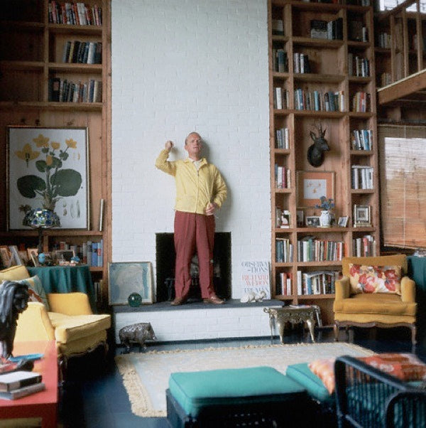
The charming eccentricities of Truman Capote's Sagaponack hideaway.
Read more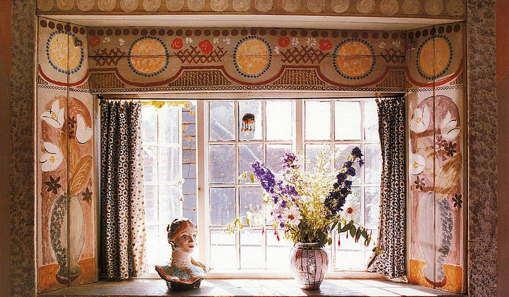
Style Spotlight: The Omega Workshops
The Modernist design group's reverberant and lasting legacy.
Read more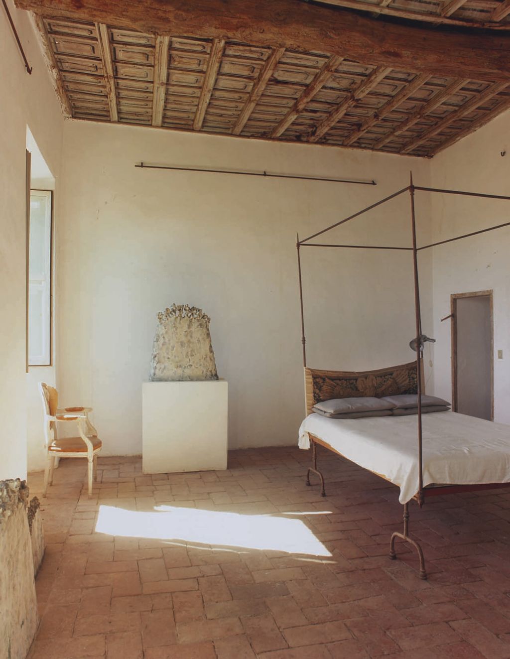
With spartan simplicity, Cy Twombly's 16th-century Italian palazzo continues to inspire.
Read more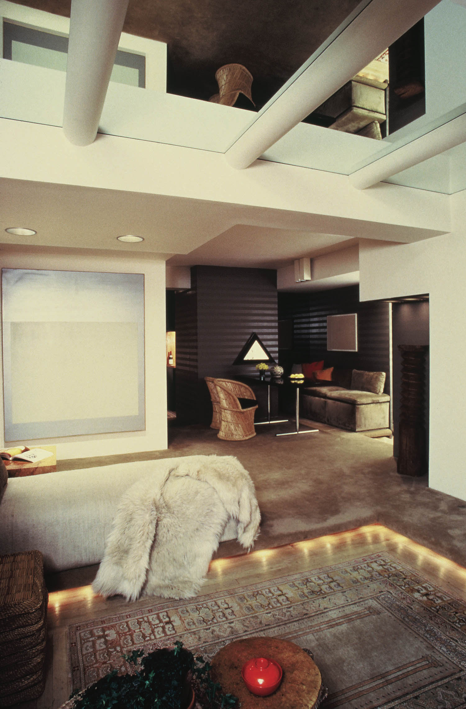
Style Spotlight: John Saladino
A rare glimpse at John Saladino's swank 1970s New York apartment.
Read more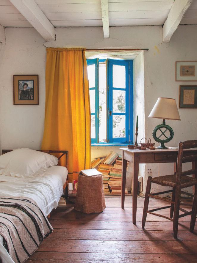
The eclectic 18th-century farmhouse in Brittany, France of Atelier Vime founders Benoit Rauzy and Anthony Watson.
Read more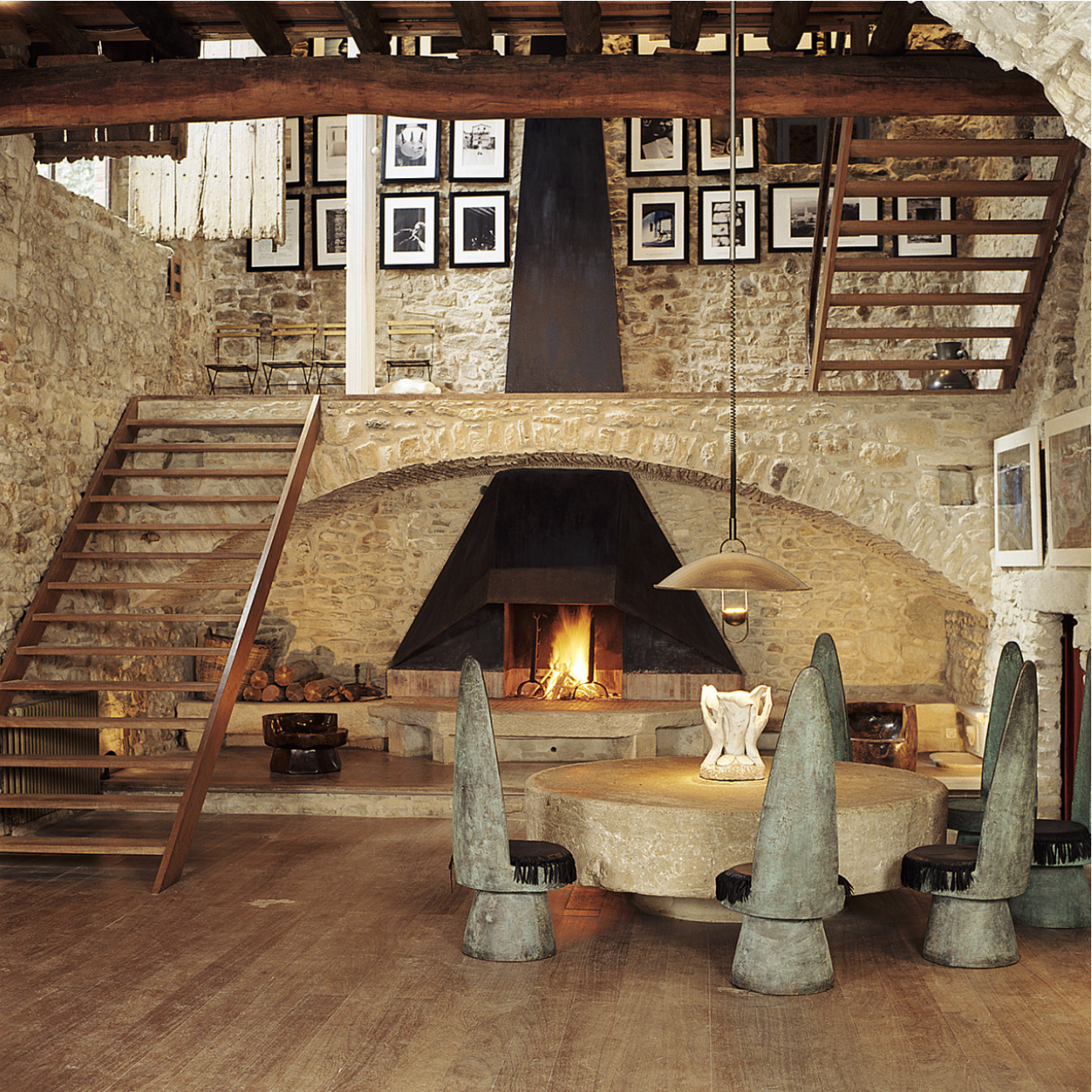
Elsa Peretti's breathtaking Casa Grande in San Martín Vell, Spain, is a source of constant inspiration.
Read more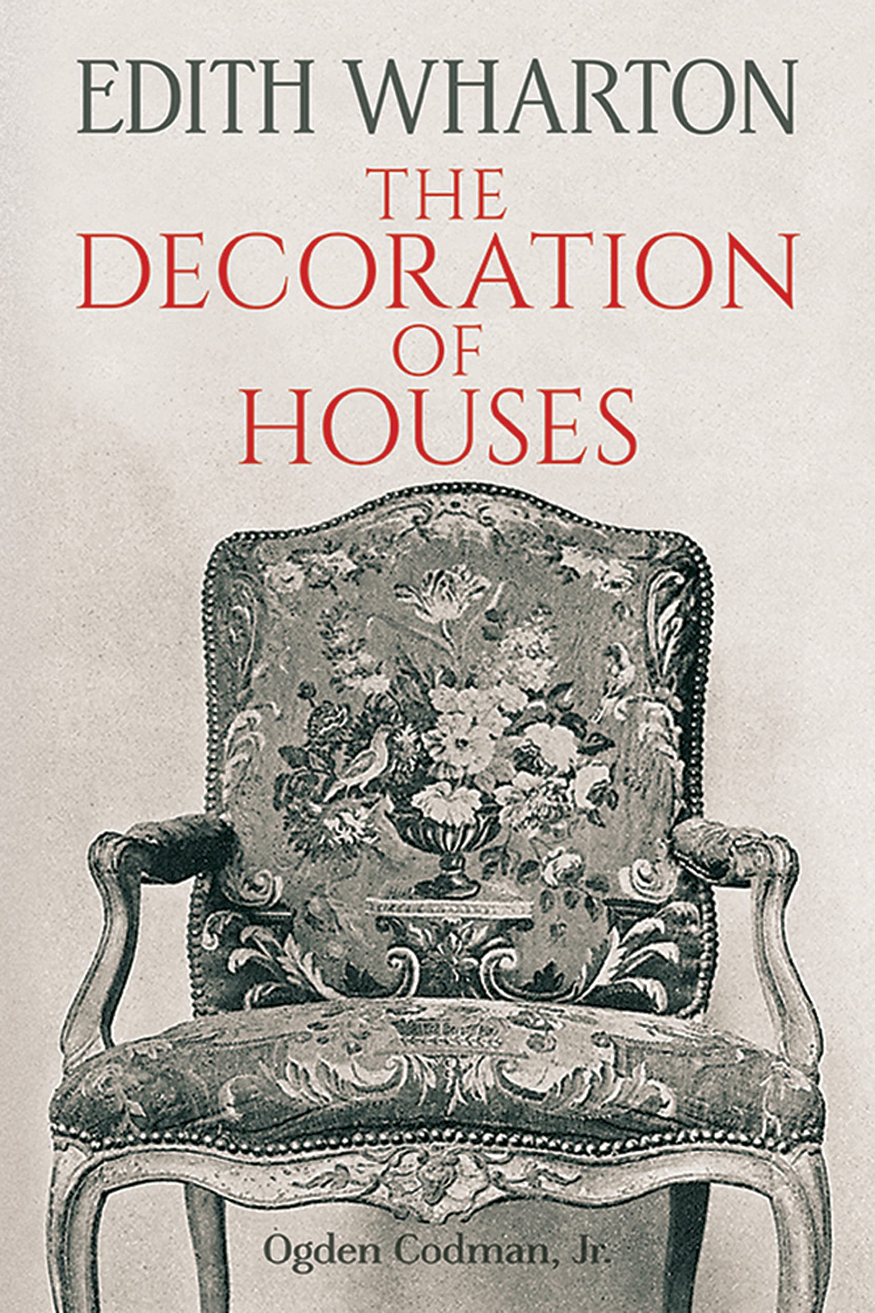
Edith Wharton's 1890 The Decoration of Houses gives surprisingly fresh design advice.
Read more
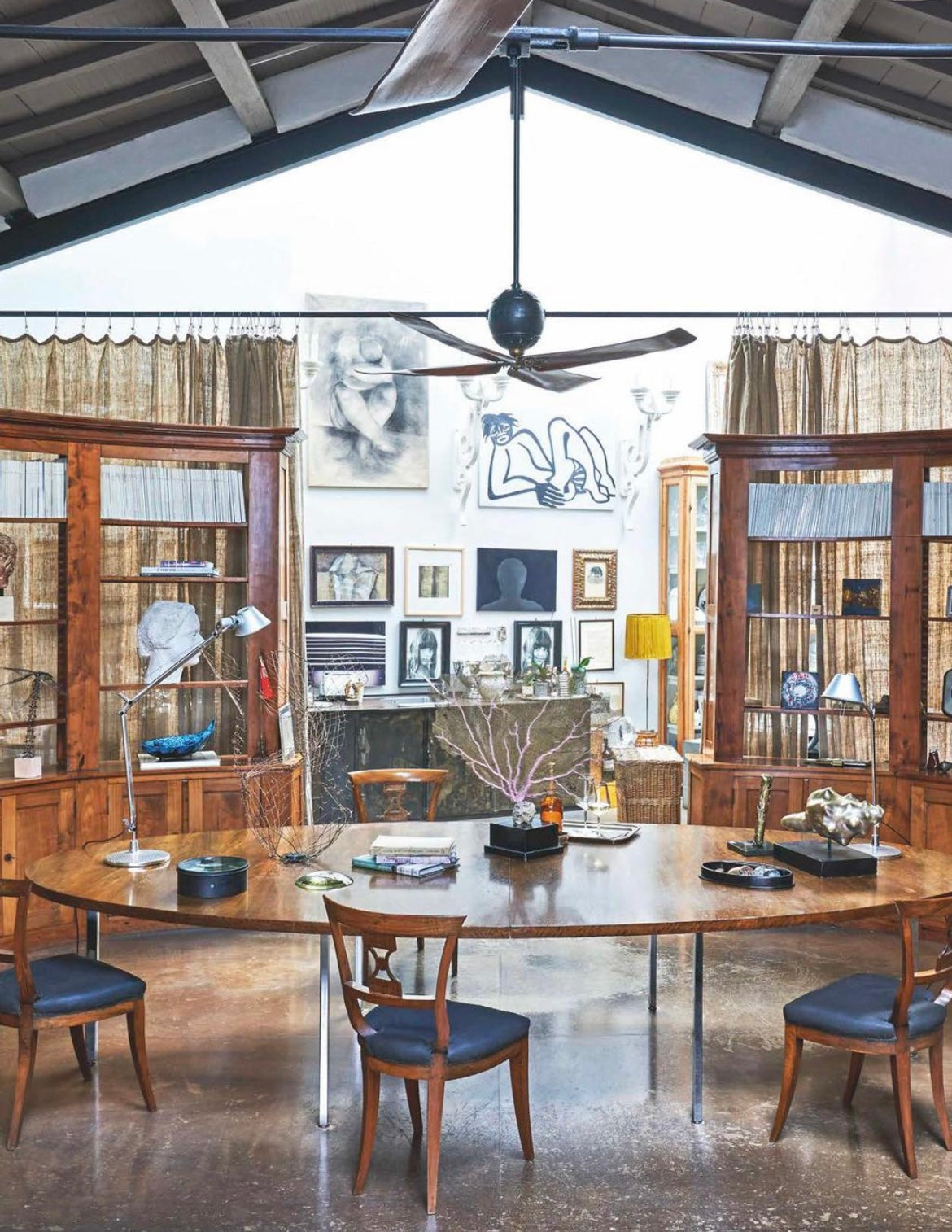
Flipping through the pages of AD Italia, something of a lightbulb went off. As I stumbled across the otherworldly gallery cum workshop that Florentine antiquarian Monica Lupi calls home, it occurre...
Read more